html{
    scroll-behavior: smooth;
}

body{
    margin: 0%;
    background-color: rgba(27, 27, 27);
}

.bodyText{
    color: white;
    font-size: 15pt;
    letter-spacing: 2px;
    size: 15pt;


    font-family: "Montserrat", sans-serif;
    font-optical-sizing: auto;
    font-weight: 300;
    font-style: normal;
}

header{
    width: 99vw;
    height: 99vh;
    overflow: hidden;
}

.headerImg{
    width: 100%;
    height: 100%;
    object-fit: cover;
}

/* Styles the space around the tabs */
.spacing{
    display: flex;
    flex-direction: row;
    justify-content: space-around;
}

/* Styles the tabs to be all caps */
#links{
    text-transform: uppercase;
}

tabs{
    float: none;
    display: flex;
    padding: 1%;
    padding-left: 10%;
    padding-right: 10%;
    justify-content: space-around;
}

rarrow{
    position: fixed;

    right: 0;
    top: 50%;
    transform: translateY(-50%);

    width: 5%;
    padding: 1%;

    display: flex;
    align-items: center;
    justify-content: right;
}

rarrow a{
    display: block;
    text-align: center;
}

rarrow img{
    max-width: 100%;
    height: auto;
    display: block;
    margin: 0 auto; 
}

larrow{
    position: fixed;

    left: 0;
    top: 50%;
    transform: translateY(-50%);

    width: 5%;
    padding: 1%;

    display: flex;
    align-items: center;
    justify-content: left;
}

larrow a{
    display: block;
    text-align: center;
}

larrow img{
    max-width: 100%;
    height: auto;
    display: block;
    margin: 0 auto; 
}


/* header font */
.subHeader {
    font-family: "Roboto Condensed", sans-serif;
    font-optical-sizing: auto;
    font-weight: 300;
    font-style: normal;
}

a {
    color: white;
    /* margin: 1%; */
    font-size: 1.5rem;
}

h1{
    text-align: center;
    letter-spacing: 5px;
    padding-top: 5%;
    font-size: 3rem;
    font-style: bold !important;
}

h2 {
    text-align: center;
    font-size: 2rem;
    letter-spacing: 5px;
}

main{
    /* background-color: rgba(27, 27, 27); */
    margin: 3% 4%;
}

/*  Example set up for all Image types in the HTML
    <div class="showcaseImages">
        <div class="subImgL"><img src="../../Images/HappyMedium/InventorySystem.gif" alt="Inventory System"></div>

        <div class="ImgD">
            <div class="subImgS"><img src="../../Images/HappyMedium/BrushAnimation.gif" alt="Brush Animation"></div>
            <p> 
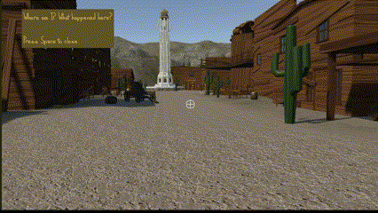
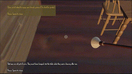
                Setting up these puzzles, the main focus was to guide the player in the direction they had to go without 
                telling them the answer.
            </p>
        </div>
        
        <div class="ImgImg">
            <div class="subImgS"><img src="../../Images/HappyMedium/openingCutscene.gif" alt="Opening Cutscene"></div>
            <div class="subImgS"><img src="../../Images/HappyMedium/Screenshot 2024-10-01 012902.png" alt="Clues"></div>
        </div>
    </div>
*/

/* .showcaseImages{
    display: flex;
} */

/* For Large Image showcase */
.subImgL{
    display: flex;
    justify-content: center;
    align-items: center;
    padding: 4% 0%;
    overflow: hidden;
}

.subImgL img{
    width: 70%;
    /* height: 100%; */
    object-fit: cover;
}

/* for small Img */
.subImgS{
    /* height: 50vh; */
    width: 40vw;
    overflow: hidden;
}

.subImgS img{
    width: 100%;
    height: 100%;
    object-fit: cover;
}

/* coupling a small image with another small image */
.ImgImg{
    display: flex;
    justify-content: space-around;
     padding: 4% 0%;
}

/* coupling a small image with a description */
.ImgD{
    display: flex;
    justify-content: space-around;
     padding: 4% 0%;
}

.ImgD p{
    width: 40vw;
    align-content: center;
}

.description{
    text-align: center;
    margin: 1.5rem;
}

.description p{
    text-align: justify;
}
footer{
    padding: 1rem;
    text-align: center;
}

/* Responsive for phone */
@media (max-width: 800px) {
    body{
        color: white;
        font-size: 12pt;
        letter-spacing: 2px;
        size: 12pt;
        /* width: 50vw; */

        padding: 5%;
    }
    
    .bg{
        padding: 2%;
        padding-top: 1%;
        padding-bottom: 1%;
    }
    
    #main{
        display: flex;
        flex-direction: column;
        justify-content: space-around;
    }

    #logo {
        float: left;
        width: auto;
        margin-bottom: 0px;
        /* height: auto; */
        /* margin: 2rem; */
    }
    
    #logo img{
        /* width: 70vw; */
        border-radius: 50%;
        max-width: 100%;
    }
    
    #text{
        margin: 10%;
    }
    
    #myWork p{
        display: flex;
        padding-left: 0%;
        padding-right: 0%;
        justify-content: space-around;
    }

    #myWork a{
        font-size: 13pt;
        padding-left: 0%;
        padding-right: 0%;
    }
    
    #links{
        /* text-decoration: underline; */
        text-transform: uppercase;
    }
    
    #tabs {
        margin: 5%;
        float: none;
        display: flex;
        padding: 0%;
        /* padding-left: 2%;
        padding-right: 2%; */
        justify-content: center;
        align-items: center;
        font-weight: bold;
    }

    #tabs a{
        max-width: 100%;
        width:fit-content;
        text-align: center;
        font-size: 13pt;
    }
    
    
    /* header font */
    .subHeader {
        font-family: "Roboto Condensed", sans-serif;
        font-optical-sizing: auto;
        font-weight: 300;
        font-style: normal;
    }
    
    a {
        color: white;
        /* margin: 1%; */
        font-size: 1.5rem;
    }
    
    h1{
        text-align: center;
        letter-spacing: 5px;
        padding-top: 5%;
        font-size: 3rem;
        font-style: bold !important;
    }
    
    h2 {
        text-align: center;
        font-size: 2rem;
        letter-spacing: 5px;
    }
  }

/* extra details */
.selected{
    color: #405ba9;
}

a{
    text-decoration: none;
}

